Explore Dashboard Components
This page provides an introduction to the components that can be added to your Dashboards.
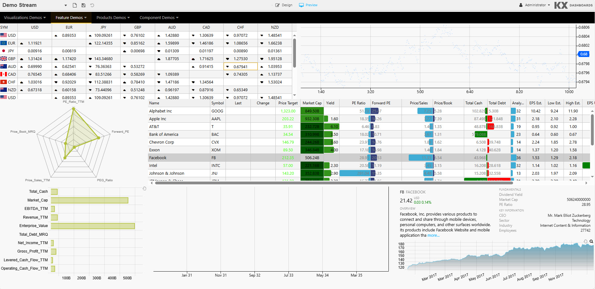
KX Dashboards supports over 40 components, which can be added to your dashboards. When you start KX Dashboards you are greeted with sample dashboards showcasing many of these components. For example, the following example includes a Navigation Menu, Data Grid, ChartGL, Radar Chart, Canvas Chart, Text.
Components
KX Dashboards provides pre-installed components providing out-of-the-box functionality while custom components allow for complete extensibility. These components are organized into categories described in the following sections.
Grids
Grid components are structured, tabular elements for viewing and interacting with row-and-column data. The Data Grid handles flat tables; the Pivot Grid adds OLAP-style drill-down and aggregation for multi-dimensional analysis.
 Grid components
|
Tabular data display and handling. |
|
|
OLAP drilldown data display. |
Charts
A suite of charting widgets spanning 2D and 3D visualizations. From basic Canvas Charts (line, bar, boxplot, etc.) to hardware-accelerated WebGL (ChartGL) and full 3D views, plus specialized forms like Pie, Radar, Gauge, and high-density financial plots.
Chart components
|
Hardware accelerated charts using WebGL; supports line, bar, bubble, waterfall, bounds, candlestick, heatmap and baseline charts. |
|
|
Circular statistical graphic. |
|
|
2D multivariate data graphic. |
|
|
Basic line, bar, bubble, candlestick, violin, boxplot and waterfall charts. |
|
|
3D charting (with highlight rule support for 4D); dot, surface, bar, grid and line charts. |
|
|
Gauge chart. |
Layout
Layout components provide containers and panels that organize the visual arrangement of components. Includes flexible split-panels, tab sets, accordions, overlays, and generic layout panels to build responsive, modular dashboards.
Layout components
|
Container for components. |
|
|
Flexible, two-component container. |
|
|
Tabbed component container. |
|
|
Collapsible component container. |
|
|
Container to overlay components. |
Inputs
Input components provide form and control elements for parameter entry: structured query forms, drag-and-drop form builder, conventional text/number/date inputs, selectors (dropdowns, radio/checkbox), and even Text-to-Speech for accessibility.
Input components
|
Input display for query parameters; text, dropdown and date picker selectors. |
|
|
Create a custom form for users. |
|
|
Single or multi-select dropdown component. |
|
|
Single button supporting multi-action select. |
|
|
A text input component. |
|
|
WYSIWYG text editor with HTML support. |
|
|
Converts text to audio. |
|
|
Radio or check-box selection control. |
|
|
Date or date-time input. |
|
|
Date rate input. |
Navigation
Navigation components provide menus and tree-style widgets for moving through application sections or OLAP hierarchies. Includes top/bottom navigation bars, breadcrumb trails for drill-through, and expandable tree views for complex category schemas.
Navigation components
|
Navigation bar. |
|
|
Navigation element for OLAP data. |
|
|
A tree-view navigation selection component. |
Data
Data components provide interactive filters, visual query builders, and controls for slicing, paging, uploading, and playing back data streams. These let analysts construct queries without code, page large sets, and step through time-series or media content.
Data components
|
User generated queries; text and dropdown filters (no coding required). |
|
|
Graph-based visual query builder; support for multi-data sources with update, group-by, join, filter and custom functions. |
|
|
A custom dropdown menu. |
|
|
A data range selector; interval or time. |
|
|
A multi-control stream player suitable for video content, interval or time sequence data playback. |
|
|
Upload a file to, or download from, a server. |
|
|
Custom paging to control the amount of data to display in a component. |
Maps
Map components provide geospatial viewers embedding vector/raster maps via built-in components or external APIs (Google Maps, Mapbox). These are useful for plotting location-based data, heatmaps, and overlays of geo-referenced datasets.
Map components
|
Geographic map. |
|
|
Map component featuring Google maps. |
Visuals
Visual components provide specialized graphics for hierarchical and network data: treemaps, sunbursts, graph/network maps, Sankey flows, bipartite connectors, and Vega-powered custom visuals. These are ideal for showing relationships and tree-structured metrics.
Visual components
|
Treemap or heatmap data graphic. |
|
|
Sunburst (ring/doughnut) chart for hierarchical data. |
|
|
Network/Flow relationship map. |
|
|
A flow diagram. |
|
|
A chart of two independent data sets, with relationship connections between the data sets. |
|
|
Support for Visualization Grammar charts. |
Financials
Financial components provide dedicated charting constructs for market data: OHLC/candlestick charts, technical indicators (VWAP, Kagi, Heikin-Ashi), annotations, and volume overlays. Built for traders and quants to analyze time-series price movements.
Financial components
|
International financial charting component; OHLC, Line, Candlestick, Mountain, Heikin Ashi, Kagi, and over 20 technical indicators and user annotation support. |
Other
Other utility and “plus” components such as: trading panels (TWAP/VWAP), contour plots, blob/file download, alert trackers, report/config managers, embedded code editors, video, external content embeds, plus advanced geospatial (Luna) and domain-specific integrations (ChartIQ, KX).
Other components
|
Add a Forex trade panel with TWAP and VWAP support and tick updates. |
|
|
Add a contour graphic; plotting 3D data in 2D. |
|
|
Download files from byte array in database. |
|
|
Bitmap generated chart. |
|
|
Add video content to a dashboard. |
|
|
Embed a KX Developer graphic into a chart. |
|
|
Embeddable code editor with support for |
|
|
Map component with 3D overlay driven by Mapbox. |
|
|
Integration of chartIQ financial charts. This requires a separate license. |
|
|
Embed web page content |
|
|
Add a quartet or matrix graphic. |
|
|
A high-performance temporal geospatial visualization graphic. |
Custom
You can also create custom components. Refer to Dashboards SDK for details.