Accordion
This page describes how to set up and configure the Accordion component to add a panel with expandable sections to your dashboard.
Each section, in the Accordion component, can hold a single component, including a nested accordion or a workspace like Layout Panel.
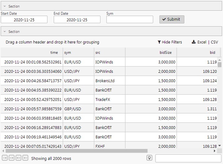
The following screenshot shows an Accordion panel with sections containing a Data Form and Data Grid.
Set up an Accordion
To set up an Accordion component, click-and-drag the component into the workspace and configure the following:
-
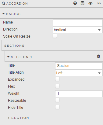
In the Basics properties define how many sections you need, by clicking + Section to add new Sections.
-
Within each section, add a single component, layout panel, or flex panel for multiple components.
Refer to Accordion properties described in the next section for details on additional properties.
Accordion properties
The following sections provides details on how to configure the properties of the Accordion component.
Basics
Open the Basics properties on the right and configure the properties described in the following table.
|
Field |
Description |
|---|---|
|
Name |
A name for the component provided by the user. |
|
Direction |
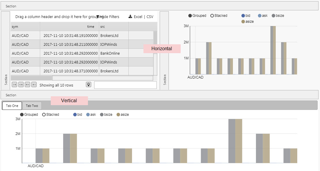
Switch between a Vertical and Horizontal accordion control, as illustrated below. You can nest one Accordion component inside another.
|
|
Scale on Resize |
This checkbox determines whether or not you resize a child component when the accordion panel is resized, or wait until after accordion resize to resize child components. |
Sections
Configure the properties described in the following table.
|
Field |
Description |
|---|---|
|
Title |
A name for the section |
|
Title Align |
Sets position of Title in section bar: |
|
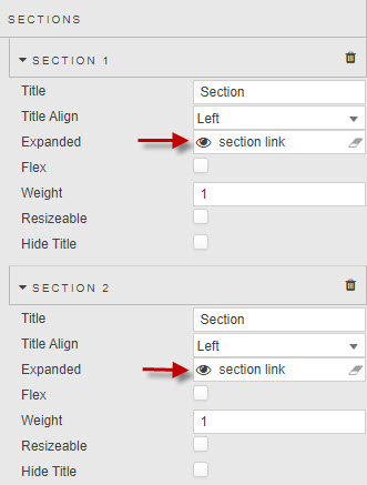
Expanded |
When checked, the Accordion loads with the section expanded. Controlling the open and closing of accordion sections can be achieved by assigning a boolean View State Parameter to the Expanded property. By setting the View State Parameter to True – on a click of a Data Form Submit button for example – users can determine when elements of the dashboard become visible. Use the same view state parameter in multiple sections allows you to link two sections, and link two accordions. |
|
Flex |
When enabled, the section resizes to accommodate its child component's dimensions where possible, for example resizing to accommodate a Data Form that can take up different heights depending on the number of items and the width of the screen. Some components, such as charts, do not specify dimensions themselves but rather fill their parent. In these cases a Flex section's dimensions is defined in pixels by Min Size and Max Size. The Weight and Resizable properties below do not apply to Flex sections. |
|
Weight |
For example, two sections of Weight This is a relative sizing measure to determine the viewable area for each section inside the Accordion. Warning If Resizable is checked, the values of Weight change on interaction. |
|
Resizable |
If checked, the user is able to adjust the section size .
The following shows an example of a user manually adjusting section size.
|
|
Hide Title |
When checked, the section title is suppressed. |

Style, Format, Margins
Configure the properties described in the following table.
|
Field |
Description |
|---|---|
|
Advanced CSS |
Refer to Advanced CSS for details. |
Refer to Style for common Style, Format and Margin settings.
Link two sections in a single accordion
If you want sections in a single accordion to share a behavior, use the same View State Parameter in their Expanded setting:
Linking two accordions
You can link two or more Accordions so an expansion or contraction in a section of one is reflected in another.
To do this, assign the same View State Parameter to each sections Expanded settings.