Pivot Grid
This page describes how to set up and configure the Pivot Grid component which displays a Pivot/OLAP control data set.
The Pivot Grid component has two types of columns:
-
Breakdown columns: These columns contain the key data points that are used to further define the aggregate data.
-
Aggregate columns: These columns produce cumulative values using predetermined functions or custom analytics.
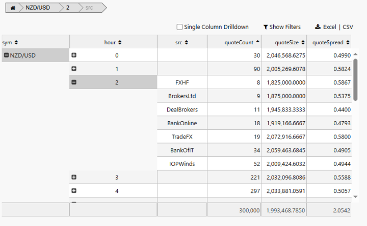
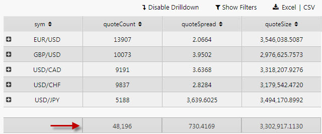
Drilldown
Drilldown refers to an action taken by the user to pursue more information about and for a given value. A drilldown is performed when the user clicks on the plus sign (+) that appears in front of the breakdown value. The additional information comes from the presentation of more breakdown columns.
The following screenshot shows a Breadcrumbs component and a Pivot Grid with the optional Pivot Grid tools.
This page provides details on how to:
Set up a Pivot Grid
To set up a Pivot Grid component, click-and-drag the component into the workspace and configure the following:
-
Define the data source, and ensure the Pivot checkbox is checked to complete the Pivot Query section in the dialog.
-
Set the Focus property to align with Breadcrumbs component. The use of a breadcrumb component is optional.
Refer to Pivot Grid properties described in the next section for details on additional properties.
Pivot Grid properties
The following sections provide details on how to configure the properties of the Pivot Grid component.
Basics
Open the Basics properties on the right and configure the properties described in the following table.

|
Field |
Description |
|
|---|---|---|
|
Name |
A name for the component provided by the user. |
|
|
Data Source |
Define the source data for the grid. Ensure that the Pivot checkbox is checked and the Pivot Query section is filled in. |
|
|
Focus |
A View State Parameter used for linking components. |
` |
|
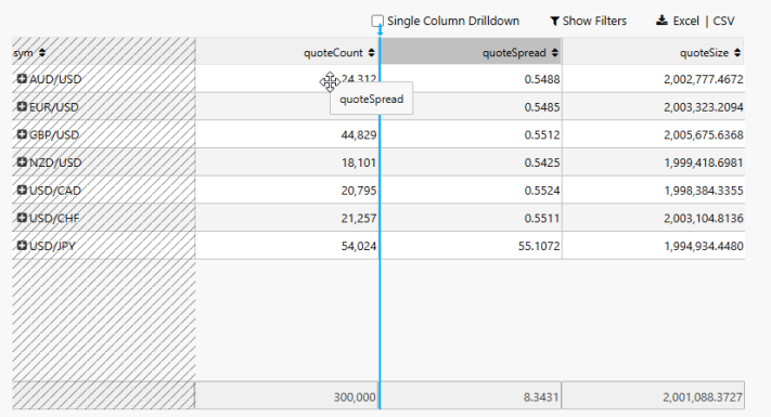
Single Column Drilldown |
This setting can limit the number of displayed breakdown columns to one.
|
|
|
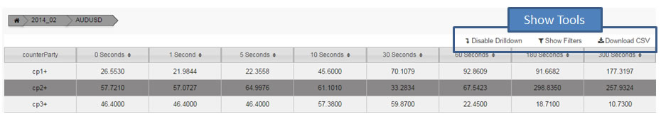
Show Tools |
When selected user controls, Drilldown, Show Filters, and Download are shown.
|
|
|
Animate |
Offer smoothing animation on drilldown versus a 'hard' drilldown. |
|
|
Multiple Drilldown |
Supports multiple OLAP drilldown paths versus the default single drilldown. |
|
|
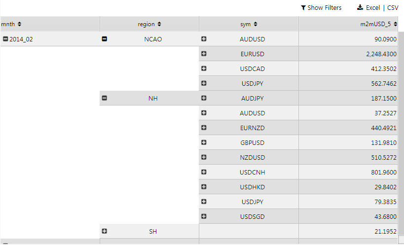
Expand All |
All OLAP elements are expanded on Pivot Grid load. The following example shows two expanded OLAP pivots.
|
|
|
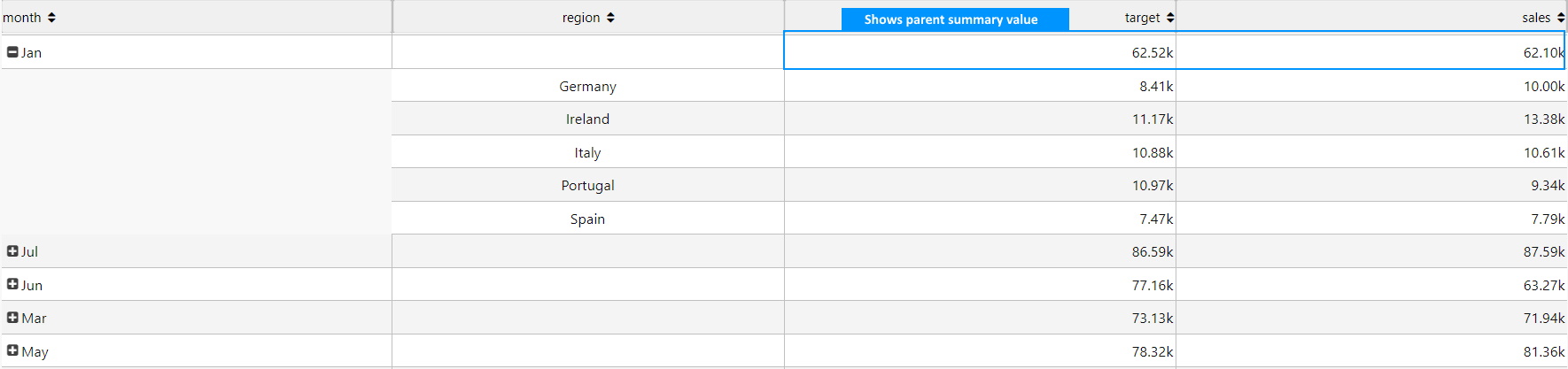
Show Expanded Summary |
For a drilldown row, when checked include the parent summary values otherwise only show the child drilldown values.
The following example shows an expanded parent summary row.
|
|
|
Use Cached Columns |
If checked, for new aggregated or breakdown columns it takes the column data from the column cache if present. |
|
|
Show Cached Columns |
When checked the Cached Columns properties are displayed. |
|
|
Sort Column/Sort Order |
Sort Column and Sort Order define the default sort order, |
|
|
Scroll Value |
A number representing the distance in pixels from the top of the pivot grid to the currently visible scroll position. |
|
|
Keep User Customizations |
When checked, changes to a column size or column position are automatically saved for the end-user and these changes are applied to the Pivot Grid when the Dashboard reloads.
The Reset View State button can be used by the end-user to restore the original column widths and column positions. |
|
|
Column Width Mode |
Select the method for calculating the width of columns in the Pivot Grid. The column width is calculated when:
There are three column width modes that determine how the columns behave when the column width(s) need to be calculated:
The option selected here determines whether Relative Width or Fixed Width is displayed in the Breakdown and Aggregate Column properties. Note Conflicting Column Width Modes If the Dashboard author changes the Column Width Mode after an end-user has saved column width sizes, the Column Width properties from the Dashboard supersede the saved end-user data. |


Breakdown columns
Breakdown columns define how the data is grouped and organized in the pivot grid. They determine the categories over which aggregate columns compute summary values.
Configure Breakdown column properties described in the following table.

|
Field |
Description |
|---|---|
|
Display Name |
Enter a name for the column. |
|
Header Tooltip |
Text description that appears when the mouse hovers over a column header. If blank, the default tooltip specifies the name of the column and a hint about what features are available to the user at that mouse position.
|
|
Minimum Width (px) |
This specifies the minimum width of the column in pixels. |
|
Fixed Width/Relative Width |
The property name varies depending on the Column Width Mode set in the Basics properties. Relative Width - This is displayed when the Column Width Mode is either This specifies a numerical value that represents the width of a column, and can be set:
Fixed Width - This is displayed when the Column Width Mode is This represents the width of its column in pixels and has a default value of 150 pixels, and can be set:
Refer to Resizing columns for further details on how these values are applied. . |
|
Text Align |
Sets the text alignment to |
|
Sortable |
This setting controls whether the Sorting feature is available to the user.
|
|
Format |
Formatted columns |
|
Precision and Hide Trailing Zeroes |
Number of decimal places used to display numeric, and whether to show trailing zeroes. |
|
Currency Symbol |
Text representation of currency symbol in data column; select from
This example shows currency columns with prefixed symbols.
|
|
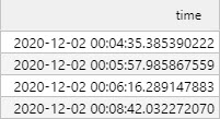
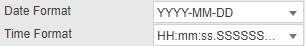
Date Format and Time Format |
Set the date and time format. This example shows timestamps with a DateTime format .
|
|
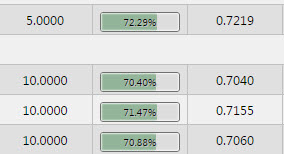
Percentage Color |
A color: where Format is Percentage, displays a mini bar in the range 0-100%. This example shows Percentage values with mini bars.
Tip View state parameter Percentage Color can be a View State Parameter: roll over the end of input bar until until the eye icon appears, click the icon to assign the view state. |
|
Template |
Apply HTML customizations with Handlebar helpers. For example: HTML Copy
Where Refer to Templates for further details. |
Aggregate columns
Aggregate columns present the numeric or quantitative values resulting from an aggregation function (i.e. SUM, AVG, COUNT).
Configure the Aggregate column properties described in the following table.
|
Field |
Description |
|---|---|
|
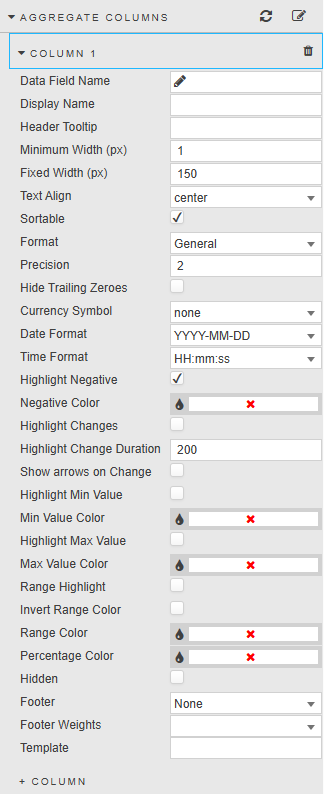
Data Field Name |
A Data Source column. |
|
Display Name |
Column name. |
|
Header Tooltip |
Text description that appears when the mouse hovers over a column header. If blank, the default tooltip specifies the name of the column and a hint about what features are available to the user at that mouse position.
|
|
Minimum Width (px) |
This specifies the minimum width of the column in pixels. |
|
Relative Width/Fixed Width |
The property name varies depending on the Column Width Mode set in the Basics properties. Relative Width - This is displayed when the Column Width Mode is either This specifies a numerical value that represents the width of a column, and can be set:
Fixed Width - This is displayed when the Column Width Mode is This represents the width of its column in pixels and has a default value of 150 pixels, and can be set:
Refer to Resizing columns for further details on how these values are applied. . |
|
Text Align |
Alignment of values inside Pivot Grid: left, center, right. |
|
Sortable |
This setting controls whether the Sorting feature is available to the user.
|
|
Format |
Formatting for the data in the column. |
|
Precision |
Where data are numeric, the number of decimal places to display. |
|
Hide Trailing Zeroes |
Removes trailing zeroes from displayed values. |
|
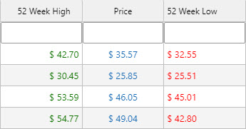
Currency Symbol |
Set the currency symbol to be used. This example shows values with prefixed currency symbols.
|
|
Date Format |
A Date format and a Time format: where Format is
This example shows a DateTime column with both a Date Format and a Time Format .
|
|
Time Format |
|
|
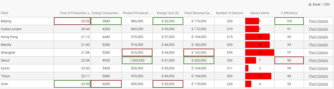
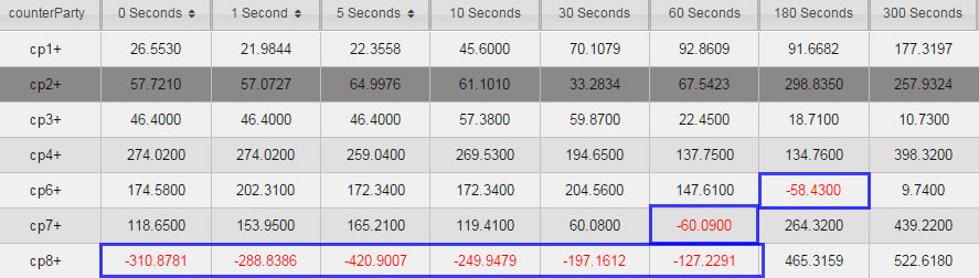
Highlighting negatives |
When Highlight Negative is checked, negative values are shown in Negative Color.
This example shows a Pivot Grid with negative numbers highlighted .
|
|
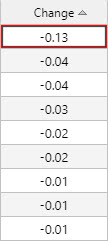
Highlighting changes |
When Highlight Changes is checked, cells are highlighted green (for higher than previous value) or red (for lower than previous value). This is used for streaming or polling data. The persistence of the highlight is controlled by Highlight Change Duration. |
|
Show arrows on Change |
When checked, up and down arrows appear when the value is greater or less than the previous value. Used for streaming or polling data. |
|
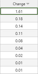
Highlighting highs, lows and ranges |
Checkboxes Highlight Min Value, Highlight Max Value, and Range Highlight apply colors to highlight values.
This example shows columns with Min Value Color, Max Value Color, and Range Color applied
|
|
Invert Range Color |
Flip range color usage. Dark shade for high values, light shade for low values. |
|
Percentage Color |
A color, used for mini-bars when Format is
Tip Colors can be view state parameters Min Value Color, Max Value Color, Range Color, and Percentage Color can be View State Parameters. |
|
Footer |
Adds a column sub-total value for
This example shows a footer with totals (sum).
|
|
Footer Weight |
Applies a weighting to current column by selected data source variable. For this to be enabled, Footer must be set to |
Selection and routing
Configure the properties described in the following table.
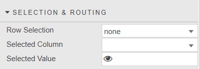
With Row Selection, values from the selected grid row or cell are mapped to a View State Parameter.
Refer to Viewstate routing for further details.
Action
Refer to Actions for details.
Highlight rules
Refer to Highlight Rules for details.
File export
Configure the property described in the following table and refer to Export for details about common settings.
|
Field |
Description |
|---|---|
|
Full Export Override |
Overrides the pivot query dataset with an alternative dataset. |
Cached Breakdown/Aggregate Columns
When Show Cached Columns is set in the Basics properties, you can configure the properties described in the following table.
|
Field |
Description |
|---|---|
|
Cached Breakdown Columns |
A list of dependent and appearance columns that can be defined by the pivot query or an user. For dynamic pivot queries where the column data can change, the cached columns can be used to populate the breakdown and aggregate column list. |
|
Cached Aggregate Columns |
Style
Refer to Style for common settings. Configure the properties described in the following table.
|
Field |
Description |
|---|---|
|
Even Row Background & Odd Row Background |
Background colors of the even and odd rows |
|
Selected Row Background |
When Enable Row Selection is checked, the background color of the selected row |
|
Expanded Summary Style |
When Enabled sets a background color, underline and bold text for the expanded summary |
|
Header Row Height |
Set the height for headers and table rows.
This example shows the results of setting different height values.
|
|
Row Height |
|
|
Header Text Transformation |
Text transformation for column headers. |
|
Header Font Weight |
Font weight for column header. |
|
Font Family |
Font family for column headers and rows |
|
Font size |
Font size for rows (css format), e.g. |
|
Advanced CSS |
Refer to Advanced CSS for details.
|
|
CSS Classes |

Adjusting the Column Layout
The following sections describe how to:
Resize Columns in a Pivot Grid
This section describes how Dashboards authors and end-users can resize columns within a Pivot Grid.
Dashboards authors can manually specify the column width by typing the size value into the column properties for the Breakdown and Aggregate columns.
To visually resize a column, whether you are the Dashboard author in Preview mode or end user viewing the dashboard:
-
Position the mouse over the right-hand border of a column's header.
The color of the border changes to the Dashboard's highlight color and the mouse pointer image changes to a column resize cursor.
-
Click and drag to the left or right. A visual guideline, that spans the full height of the component, becomes visible until the mouse button is released.
-
Release the mouse button once the desired width is visualized. The new column width is adjusted to this position.

When columns are resized visually by the Dashboard author, the value of the Relative Width/Fixed Width column property in the Breakdown and Aggregate columns properties section are automatically updated.
Information
To preserve column width changes made by the end-user, check the Keep User Customizations checkbox in the Basics properties.
Reorder Pivot Grid columns
The following steps describe how to reorder the columns in a Pivot Grid.
-
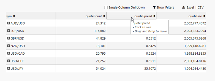
Position the mouse over a column's header. The default tooltip specifies the name of the column and a hint about the features available to the user at that mouse position.
-
Left click and continue to hold down the mouse button:
-
A label with the column name appears and moves with the mouse pointer.
-
The mouse pointer image changes to a move cursor if the column can be moved to the target destination, or a not allowed cursor if the location is invalid.
-
The other column type (breakdown/aggregate) has a strikethrough appearance to indicate to the user that the column being moved cannot be moved to that area.
-
When moving the mouse across the pivot grid, a visual marker appears as an arrow pointing down to a vertical line spanning the component's height to show the intended destination of the moved column when the user releases the mouse button. The position of the marker is determined by the nearest applicable column boundary.
-
If the pivot grid has a horizontal scrollbar, when the mouse is close to the left or right hand edge of the component, it is in the automatic scroll zone when it is within 15% of the grid's visible width. In this scenario, the grid automatically scrolls in the direction of the nearest edge for the grid and the scrolling speed accelerates as the mouse moves closer to the component's edge.
-
-
Release the mouse button to move the column to the location indicated by the visual marker.
Information
To preserve column position changes made by the end-user, check the Keep User Customizations checkbox, in the Basics properties.
Information
If the Header Tooltip property for a column has been specified, the tooltip does not include the hint(s).
If the column's Sortable property is unchecked, the default tooltip hint does not include text that says Click to sort.
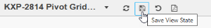
Note
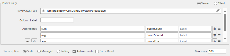
When the Breakdown Cols value in the Pivot Grid's data source is specified using a view state, as shown below:
The end-user must click Save View State to preserve any reordering of breakdown columns when a view state is used to specify the breakdown columns in the data source.