Sunburst Chart
This page describes how to set up and configure the Sunburst Chart component
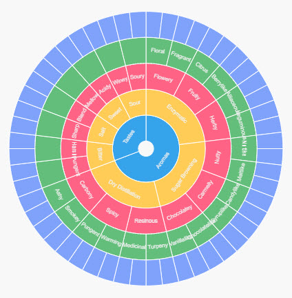
A Sunburst Chart has an inner circle surrounded by rings of deeper hierarchy levels. The angle of each segment is proportional to a value or divided equally under its parent node., as shown here.
Set up a Sunburst Chart
To set up a Sunburst Chart component, click-and-drag the component into the workspace and configure the following:
-
Assign a data source.
-
Set Breakdown with a view state parameter of type
list, with the categories from your data source.
Refer to Sunburst Chart properties described in the next section for details on additional properties.
Sunburst Chart properties
The following sections provides details on how to configure the properties of the Sunburst Chart component.
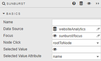
Basics
Open the Basics properties on the right and configure the properties described in the following table.
|
Field |
Description |
|---|---|
|
Name |
A name for the component provided by the user. |
|
Data Source |
Refer to Data sources for details. |
|
Focus |
A view state parameter for linking components. |
|
Node Click |
Select an option:
|
|
Selected Value |
A view state parameter storing the selected hierarchy level as defined by Selected Value Attribute. Selected Value Attribute is one of |
|
Selected Value Attribute |
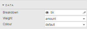
Data
Configure the properties described in the following table.
|
Field |
Description |
||||||||||||
|---|---|---|---|---|---|---|---|---|---|---|---|---|---|
|
Breakdown |
Type |
||||||||||||
|
Weight |
Dependent (numeric) variable from data source to define node size. |
||||||||||||
|
Color |
|
Config
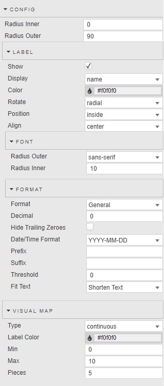
Configure the properties described in the following table.
|
Field |
Description |
|---|---|
|
Radius Inner |
A Radius Inner value above zero adds a 'doughnut' hole to the Sunburst chart. |
|
Radius Outer |
A Radius Outer value at 100 bounds the sunburst chart to the top and bottom of the component boundaries. |
Label
Configure the properties described in the following table.
|
Field |
Description |
|---|---|
|
Show |
Toggle to show Display labels for each node value. |
|
Display |
Display values are taken from a column in the data source. |
|
Color |
Font color for labels |
|
Rotate |
Set the position and alignment of labels. |
|
Position |
|
|
Align |
Font
|
Field |
Description |
|---|---|
|
Radius Outer |
Sset the font size and font style of node labels. |
|
Radius Inner |
Format
|
Field |
Description |
|---|---|
|
Format |
Format of label |
|
Decimal |
For numeric Formats |
|
Hide Trailing Zeroes |
|
|
Date/Time Format |
For Datetime Format |
|
Prefix |
|
|
Suffix |
Add a piece of text, for example a currency symbol or percentage, before or after the label. |
|
Threshold |
Frequency of node labels. |
|
Fit Text |
Select between |
Visual map
Configuration for visual map of data color options
|
Field |
Description |
|---|---|
|
Type |
Select between |
|
Label Color |
Font color of Pieces label |
|
Min |
Set the min/max range of the visual-map gradient. |
|
Max |
|
|
Pieces |
Number of |
Tooltip
Click the Tooltip checkbox to display a tooltip on rollover of node values and labels.
Highlight Rules
Refer to Highlight Rules for details.
Style, Format, Margins
Refer to Style for details.