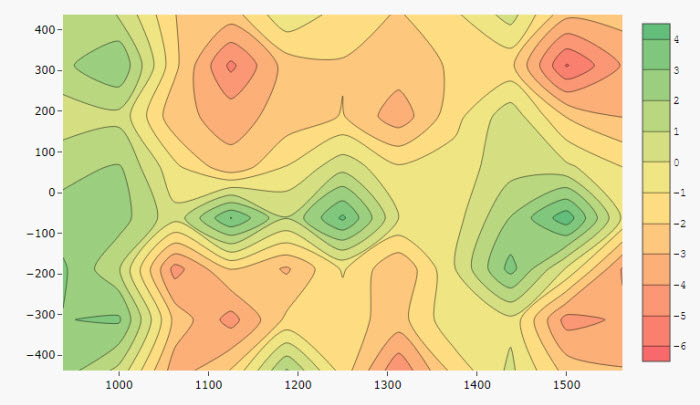
Contour
This page describes how to set up and configure the Contour component enabling you to display a three-dimensional surface on a two-dimensional plane.
Set up a Contour
To set up an Contour component, click-and-drag the component into the workspace and configure the following:
-
Add a data source.
-
Define the X- and Y-Axis to plot.
-
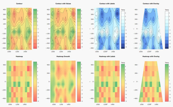
Shading is defined by the Z-axis and the color gradient. Use the Tick interval to set the gap in the number of display labels for the z-axis.
Refer to Controur properties described in the next section for details on additional properties.
Contour properties
The following sections provides details on how to configure the properties of the Contour component.
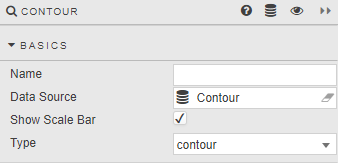
Basics
Open the Basics properties on the right and configure the properties described in the following table.
|
Field |
Description |
|---|---|
|
Name |
Enter a name for the component. |
|
Data Source |
Refer to Data sources for details. |
|
Show Scale Bar |
When checked, the scale for the response (contour) variable, Z-axis is displayed. |
|
Type |
Select between
|
X-, Y- and Z-Axis
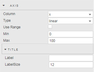
Configure the properties for each Axis described in the following table.
|
Field |
Description |
|---|---|
|
Column |
Select a data column from the Data Source. |
|
Type |
Select the axis type: |
|
Use Range |
Use these fields to set axis range values. The axis defaults to data range if these are not set. |
|
Min |
|
|
Max |
Note
Z-axis
Determines the line interpolation and contour colors as defined by range Min and Max, or default data minimum and maximum.
Title
|
Field |
Description |
|---|---|
|
Label |
Enter a name for the axis. |
|
Label Size |
Set the font size for the axis. |
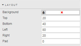
Layout
Configure the properties, described in the following table.
|
Field |
Description |
|---|---|
|
Background |
Set color background of chart |
|
Top |
Use these fields to set the chart margins, in pixels. |
|
Bottom |
|
|
Left |
|
|
Right |
|
|
Pad |
Set the central chart image padding, in pixels. |
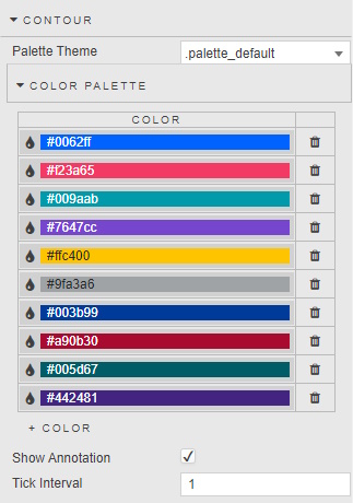
Palette Theme
Refer to Palette Theme for details.
Contour Palette
Configure the properties, described in the following table.
|
Field |
Description |
|---|---|
|
Palette Theme |
Refer to Palettes for details. |
|
Color Palette |
Sets the number of colors used in the range. Range values are spread evenly across the number of defined colors. |
|
Show Annotation |
Adds overlay of contour values |
|
Tick Interval |
Define tick label frequency on gradient bar. |
Tooltip
Configure the properties, described in the following table.
|
Field |
Description |
|---|---|
|
Show Tooltip |
This is checked by default, to display of x-, y- and z-axis (shade) values; defined in Custom Tooltip. |
|
Custom Tooltip |
Use this field to create a custom tooltip. The default is a sample tooltip used by Show Tooltip. |
Image
Configure the properties, described in the following table.
|
Field |
Description |
|---|---|
|
Source |
Use this to replace the map with an image sourced from an URL. Can be a view state parameter |
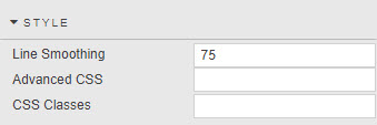
Style, Margins, Format
Configure the properties, described in the following table.
|
Field |
Description |
|---|---|
|
Line Smoothing |
Determines line smoothing; a value of zero reflects no smoothing, 100 is maximum smoothing. |
|
Advanced CSS/CSS Classes |
Refer to Style for common settings. |