Layout Panel
This page describes the Layout Panel component and how it can be set up and configured.
Layout panels are used to nest components within the dashboard. You can add them to any panel component or directly to the dashboard itself.
Layout Panels are best used within Flex Panel, Tab Control and Accordion components or to create elements like navigation menus.
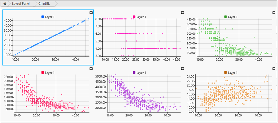
You can add any component to a Layout Panel. The following example shows a Layout Panel with multiple Chart GL components.
This page provides information on the following:
For details on common properties used by this component refer to the following:
Set up a layout panel
To set up a Layout Panel:
-
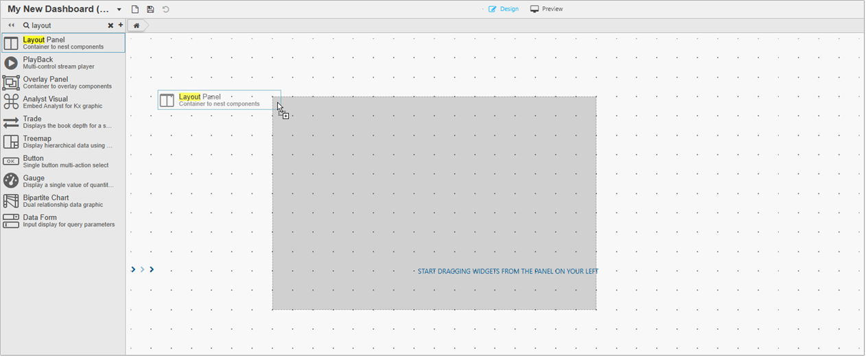
Click and drag a Layout Panel into the workspace.
-
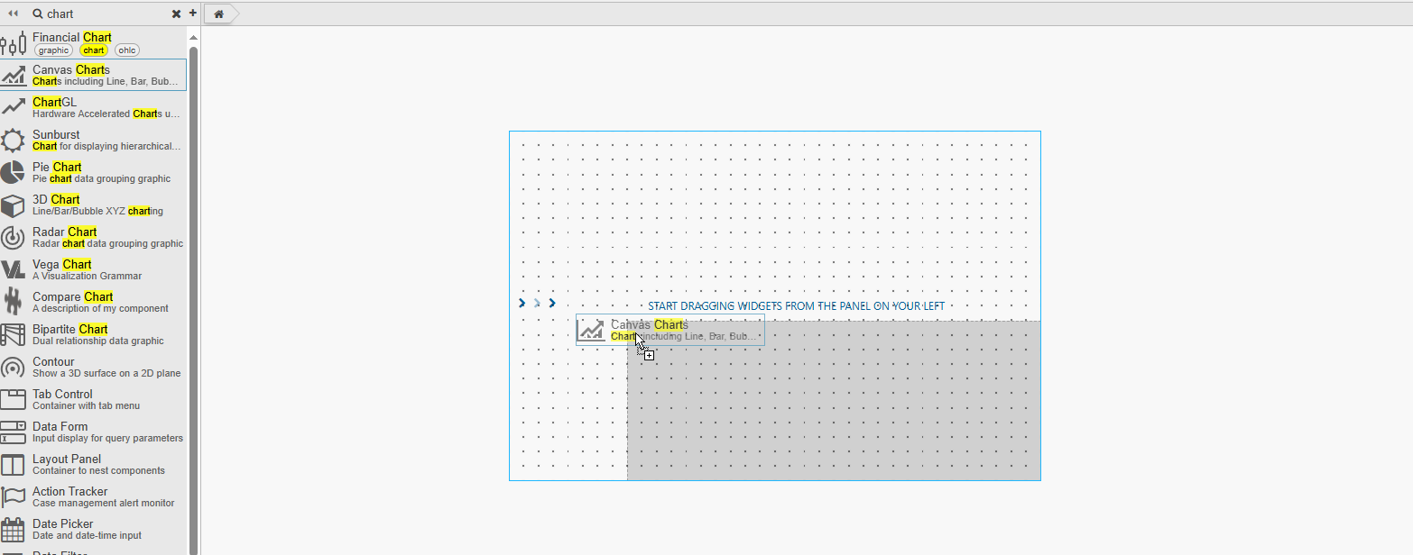
Click and drag a component to the Layout Panel. This fills the area of the Layout panel, but can be resized to add additional components.
-
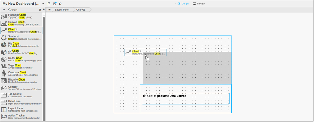
To add additional components, click and drag them from the left-hand panel and drop them within the boundary of the Layout Panel.
-
Refer to Layout Panel properties described in the next section for details on additional properties.
Layout Panel properties
The following sections provides details on how to configure the properties of the Layout Panel component.
Basics
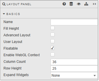
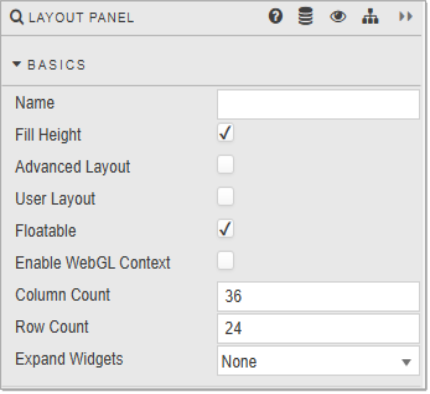
Open the Basics properties on the right and configure the properties described in the following table.
|
Property |
Description |
Default |
|---|---|---|
|
Name |
Enter a name for the component. |
Blank |
|
Fill Height |
When checked, this auto sizes nested components to fill the height of the Layout panel. If this is unchecked Row Count becomes Row Height. It is recommended to enable this after adding all required components to the panel |
Checked |
|
Advanced Layout |
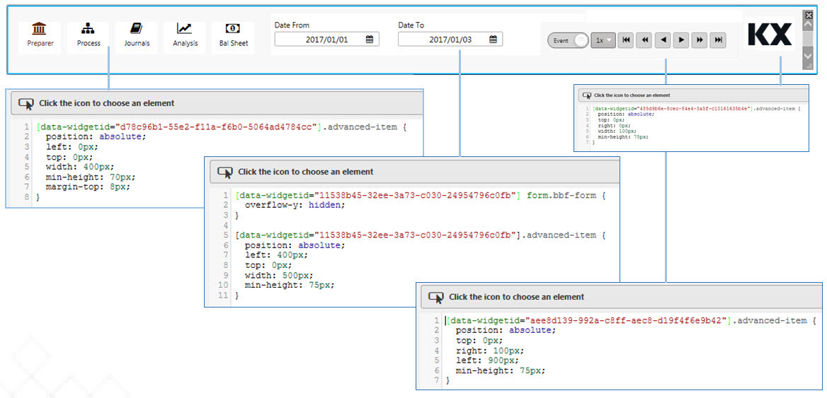
This is used to best-fit components according to panel width. Components stack on resizing. CSS can be used to position components and use fixed-sizing to prevent component resizing on changes in browser width. Use
When both Fill Height and Advanced Layout are enabled, only Advanced Layout rules applies. |
Checked |
|
User Layout |
This allows for user arrangement of components. When checked, users can add, remove and reposition components. Refer to User Layout for further details. |
Unchecked |
|
Floatable |
When enabled, an added component snaps to the nearest row anchor. Otherwise, the component always snaps to the top row. |
Checked |
|
Enable WebGL Context |
When enabled, every ChartGL widget that is directly added to the Layout Panel shares a single WebGL context. |
Unchecked |
|
Column Count/Row Count/Row Height |
These define the Layout Panel grid size. Components added are locked in position to this grid. The grid is visible when a component is dragged into position. Row Height is displayed when Fill Height is unchecked. This is the height in pixels between each grid row.
The number of grid rows used is defined by the prior Row Count value; for example if Row Count is 30 and Row Height is set to 30; then the distance from top to bottom - in the absence of Fill Height - is 900 pixels; that is 30 x 30. If the pixel height is greater than the browser height, a scroll bar appears and some components may be positioned off-screen. |
|
|
Expand Widgets |
This controls whether users can expand and collapse widgets within the Layout Panel. The options are:
The following screenshot shows a Layout Panel with six ChartGL components with Expand Widget set to Fill Panel.
In Preview mode you can see that each widget has an expand icon in the top right-hand corner of the widget.
When you click on the expand icon the widget expands to fill the entire panel, as shown below.
|
None |
|
This checkbox enables or disables the repeatable panel feature. When checked, the Layout Panel is duplicated based on the
Note that you can edit only the child contents of repeatable panel when this property is unchecked.
Refer to Repeatable Panels for further information on using this feature. |
|
|
|
This view state defines the list of values used to generate multiple repeating panels. Each value is passed as an input into the corresponding repeating panel instance. The number of repeating panels corresponds to the length of this list. |
|
Tip
Auto size components
Unless you have a reason to lock the size of components dropped into a Layout panel, check both Fill Height and Advanced Layout. This ensures the components in your Layout panel auto size along with the Accordion or Tab Control section that contains it. Refer to Basics for further information about these properties.
Style, Margins, Format
Refer to Style for common Style, Margins and Format settings.
Customize User Layout
You can configure the Layout Panel to allow users to customize the layout. This is done by enabling User Layout in the Basics properties. Once the Dashboard is save users can do the following:
-
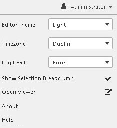
Click Open Viewer, in the User Menu, shown below, to open the dashboard in a new window.
-
Click the Customise Dashboard icon, as shown below. This adds a Component Layout icon to the top right-hand corner of the panel

-
The components are now movable and can be repositioned. The following shows the position of the components has been swapped around.

-
Components can be deleted.

-
Components that have been removed (and hidden) can be returned (or included) by clicking on the Component Layout button and selecting them from the list. Components are identified by their title, user-defined name or component type, and in that order of preference. Clicking Reset Layout restores the layout of the components to their original state.
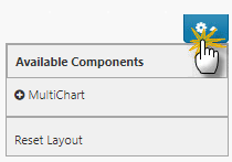
-
Once complete, click the settings icon

-
Click the Save Viewstate icon to save the new layout.

Repeatable Panels
Repeatable Panels offer a scalable and efficient way to dynamically generate multiple instances of a layout or visualization based on a list of values from the view state. Instead of manually duplicating and configuring panels for each data item, you define a single panel once and mark it as repeatable.
When a panel is set to repeat , the KX Dashboards automatically renders a copy of that panel for each item in the specified view state list. Each repeated instance inherits the panel's layout and configuration, but is contextually bound to the current value from the list enabling tailored views or visualizations for each data slice.
This feature enhances scalability and consistency in KX Dashboards, especially when visualizing metrics across multiple entities, such as instruments, regions, or devices.
Benefits
-
Reduces duplication: No need to copy/paste the same panel multiple times for different values.
-
Dynamic dashboards: Autokmatically adjusts to changes in the view state list, such as newly added symbols or regions.
-
Consistency: Ensures uniform styling and behavior across all repeated panels.
-
Efficiency: Makes dashboards easier to maintain, extend, and understand.
Use cases
Use repeatable panels when:
-
You need to display the same visualization or layout across multiple items (for example, one chart per symbol, or one table per region).
-
The list of items may change dynamically, and you want your dashboard to adjust without manual edits.
-
You want to compare items side-by-side in a consistent format.
-
You need to reduce maintenance overhead, since updating one panel updates all repeated instances.
Enabling repeatable panels
To configure a panel as repeatable:
-
Open the Layout Panels Basics properties.
-
Enable Repeatable Panels.
-
Define the Repeatable Viewstate .
Writing queries for repeatable components
To make a q query repeatable:
-
Insert the variable
$repeatViewstateinto your q query.At runtime,
$repeatViewstateis replaced with each value from the Repeatable Viewstate list, generating one query per value. -
The following example query is described in the next section.
Copyselect [5] by time from dfxQuote where sym = $repeatViewstate
Example
This example shows a Layout Panel containing two ChartGL components that are repeated for each currency pair selected from the dropdown list.
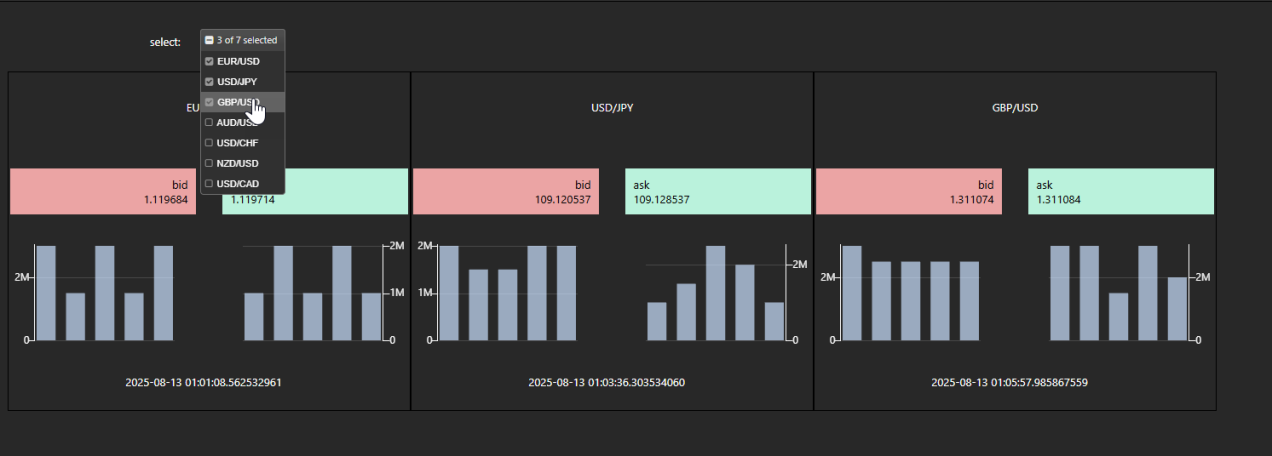
This is configured as follows:
-
The Dashboard has been configured with:
- A Layout Panel containing two ChartGL components; one for Bid and one for Ask
- A Drop Down List component from which the currency pairs are selected and passed to the
selectedview state. This view state determines how often the panels are repeated.

Note that the ChartGL components can be edited only when Repeatable is unchecked.
-
The Data Source for the ChartGL/Layer/Bid Size is set to the following query:

-
The
selectedview state list is set in the Data Source for the Drop Down List component. This view state determines how many times the panel is repeated and what values each instance uses.
At runtime, the repeatable panel expands into multiple instances: one for each item selected from the dropdown list. The example at the top of this section shows three pairs selected, resulting in three ChartGL panels.
Each instance substitutes the
$repeatViewstatewith a specific value, for example:-
select [5] by time from dfxQuote where sym = `$"EUR/USD" -
select [5] by time from dfxQuote where sym = `$"GBP/EUR" -
select [5] by time from dfxQuote where sym = `$"JPY/EUR"
-
select [5] by time from dfxQuote where sym = $repeatViewstate Here, $repeatViewstate is a placeholder that is replaced, at run time, with each value from the value set in Repeatable Viewstate in the Layout Panel Basics properties.
Each panel instance runs independently, showing data for one symbol. This provides a consistent layout and enables parallel comparisons.
