Custom Logo
This page describes how to replace the default KX Dashboards logo with a custom logo.
Set up
To set up a KX Dashboards environment with custom styling, create a style.css file SVN project repository. This file should follow from the trunk/branch path as follows:
CSS
dashboard-theme/theme/***/style.cssNote
Package is installed alongside native HTML5 KX Dashboards Install.
On every KX Dashboards release, re-install the logo package.
Header logo
Style the logo using the following CSS selector:
CSS
div#appdiv .quick-base.login-dialog .logo
Background
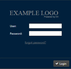
The CSS background property can be used to replace the logo with a loginTitle.svg image, assuming the image file is a sibling of style.css
CSS
background: transparent url("login_logo.svg") no-repeat 1px 10px;
otherwise
CSS
url("../images/login_logo.svg")
thus
CSS
div#appdiv .quick-base.login-dialog .logo {
 background: transparent url("login_logo.svg") no-repeat 1px 10px;
}
Note
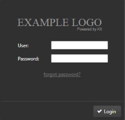
Ensure the replacement logo uses a transparent background and has dimensions which fit within the login dialog; for example, 250 x 50px.
Login background and font color
Changes can also be made to logo and font color using CSS; for example:
CSS
div#appdiv .quick-base.login-dialog.ui-front
Color can be changed using hexadecimal color codes.
CSS
background-color: #00203c;
to give
CSS
div#appdiv .quick-base.login-dialog.ui-front {
   background-color:#00203c;
}
Change User and Password to a gray color matching the logo.
CSS
div#appdiv .quick-base.login-dialog.ui-front {
   background-color:#00203c;
   color:#a2a2a2;
}
Login button
To change the login button style to match font and image use:
CSS
div#appdiv .quick-base.login-dialog.ui-front button.ui-button {
   background: #012e56;
   color:#a2a2a2;
}
Top-right logo
To change the default logo next to the Administrator dropdown menu top-right, use:
CSS
div#appdiv .main-toolbar .logo,
div#appdiv .toolbar .logo {
   background: transparent url("top_logo.svg") no-repeat 3px 2px;
}
Different selectors used for Editor/Preview and Quickview:
CSS
div#appdiv .main-toolbar .logo
div#appdiv .toolbar .logo
In the above example, the “Example logo for KX” image uses a transparent background with a dimension of 195 × 22 px.
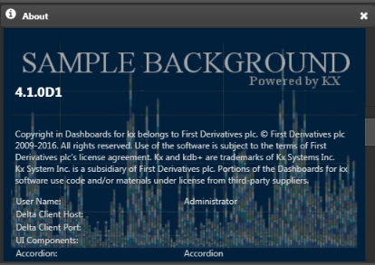
The About dialog
Changes to the About dialog (available from the Administrator dropdown) can be made using:
CSS
div#appdiv .quick-base.dashboard-name-prompt > .splash{
    background: transparent url("about_alt.png") no-repeat 3px 2px;
}
The text 4.1.0D1 describes the KX Dashboards version and is not part of the background image.
Changes to the style of this text can be made using:
CSS
div#appdiv .quick-base.dashboard-name-prompt > .splash > .version{
    color: #8a8a8a;                                 /* text color */
    font-family: 'Times New Roman', Times, serif;   /* font name used */
    font-size: 2em;                                 /* text size */
}