Demo Dashboards
This page introduces a comprehensive set of demos that showcase KX Dashboards capabilities and provide practical examples you can explore and adapt to build your own dashboards.
Explore demos
When you launch KX Dashboards you are presented with the demo dashboard which provides a catalog of fully interactive dashboard examples designed to illustrate the end-to-end capabilities of KX Dashboards visualization and analytic components.
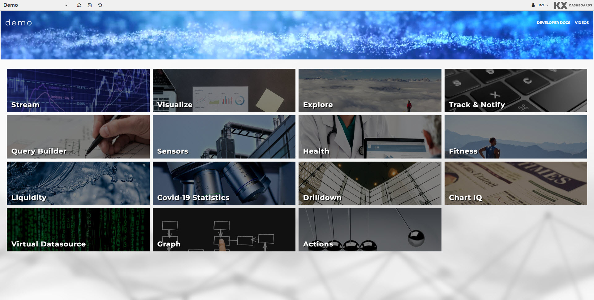
Each tile links to a dashboard in Preview mode, allowing you to explore the full extent of the components available.
For example click on the Visualize tile to open the Demo Visualize dashboard.
This dashboard, presents a rich set of interactive visualizations designed to support exploratory data analysis and insight generation across diverse datasets.

The first tab displayed shows key chart types including:
-
Bar & Line Charts: Ideal for trend and comparison analysis across categories or time.
-
Bubble & Scatter Plots: Useful for multivariate analysis and identifying correlations or clusters.
-
Area Charts: Highlight cumulative values and trends over time.
-
Boxplots & Violin Plots: Provide statistical summaries and distribution insights.
-
Candlestick Charts: Tailored for financial time series, showing OHLC (Open, High, Low, Close) data.
Click on other tabs to continue to explore this sample dashboard.
Demo configuration
You can switch to design mode on any demo dashboard to view its underlying configuration. Simply insert /edit/ between the URL and #dashboard reference and click enter to update the dashboard to design mode.

In design mode you can examine component properties, review query definitions, and inspect layout hierarchies.

Explore the full suite of demo dashboards to help you reverse-engineer these dashboards, and accelerate your own dashboard development.

Further Reading